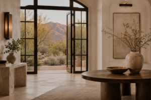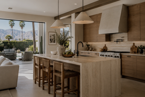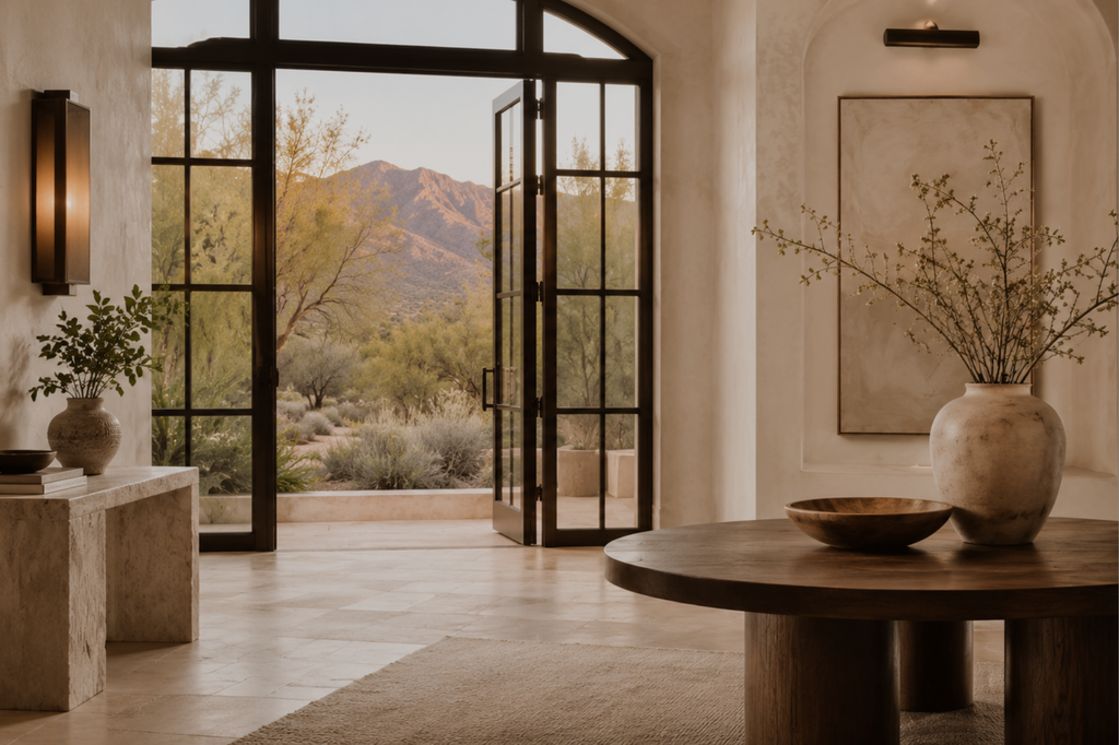
I think color is one of the easiest decisions to underestimate when preparing a home to go on the market. Someone asks what tone to use in the main living space, and within an hour you are standing in front of a rack of nearly identical swatches, unable to remember which one felt right five minutes ago. I have walked through listings where every finish was chosen well, and something still felt slightly off. More often than not, the answer was the color surrounding all of it.
I had a seller recently want to install black and gold chandeliers, and I redirected them. The gold was a different tone. The look, style and color of the fixtures would have changed the whole feeling of the house. More importantly, they would have limited the buyers who could immediately see themselves there, which can ultimately limit offers. The lighting we chose instead made the rooms feel airy and brighter and opened up the design style.
That experience is a good reminder that color is not just about paint. People can spend hours choosing a wall color because it is on trend, without looking at the floors, cabinets, countertops, furniture, hardware, and lighting already in the home. Before choosing a paint color, I want to understand the overall feeling.
In my own family room, I love keeping things light and calm, then changing the mood throughout the year with a few simple details. I tend to start with warm paint and a natural sofa, then bring in colors through pillows, rugs, blankets, and flowers.
In this market, those decisions matter. A buyer touring a home is reacting to how the whole room comes together. This is part of why I encourage sellers to sit with a color on the wall before committing, rather than trusting a small sample under store lighting or on a screen.
Cooler or moodier tones can work beautifully too, particularly in bathrooms and bedrooms. I love wallpaper in a powder room, and deep marble patterns in smaller spaces can feel timeless. These are good places to add personality without allowing one strong choice to take over.
Hardware and lighting deserve the same consideration. I love warm, natural hardware, and I am admittedly a sucker for gold, but there are many different golds. A bright finish can change the feel of a room and take away from its sense of depth and quality. If the finishes do not have enough richness or dimension, they can make a room feel less considered. Mixed metals can work beautifully when the finishes feel intentional with the rest of the home.
The good news is that if your more expensive finishes are neutral and timeless, it is easy and relatively inexpensive to change the hardware, rugs, paint, pillows and lighting later. None of this means every wall should default to the same shade of white. Neutral does the job well precisely because it steps back and lets the light and layout carry the room.
Of course, there is a completely different side to choosing color when you are not preparing a home for sale. You get to be a little more selfish. I actually think those are the choices that make a home memorable. The spaces we love most are rarely the ones where every decision was made with resale in mind. They reflect the people living there. So whether you are renovating a Desert Ridge home or ready to repaint a room that has been bothering you for years, I would start by looking at the feeling of the entire home. Then choose the color.